graphic Design, Sculpture, Installation
もったいない
(Mottainai)
January - March 2019
Mottainai is a two part project based on single-use items, waste production, and over-consumption. It aims to raise awareness on the way we consume and and provides a possible solution on how we can re-adopt a waste refusing culture.
Project type
Class project: Word + Image with Rebeca Mendez
Area of focus
Graphic Design
Copywriting
Illustration
Typography
Fabrication
Photography
Copywriting
Illustration
Typography
Fabrication
Photography
Objective
Explore the concept of "waste" through typography and create a visual language that challenges our society's consumption habits while providing a possible solution to the effects of environmental destruction.
Research
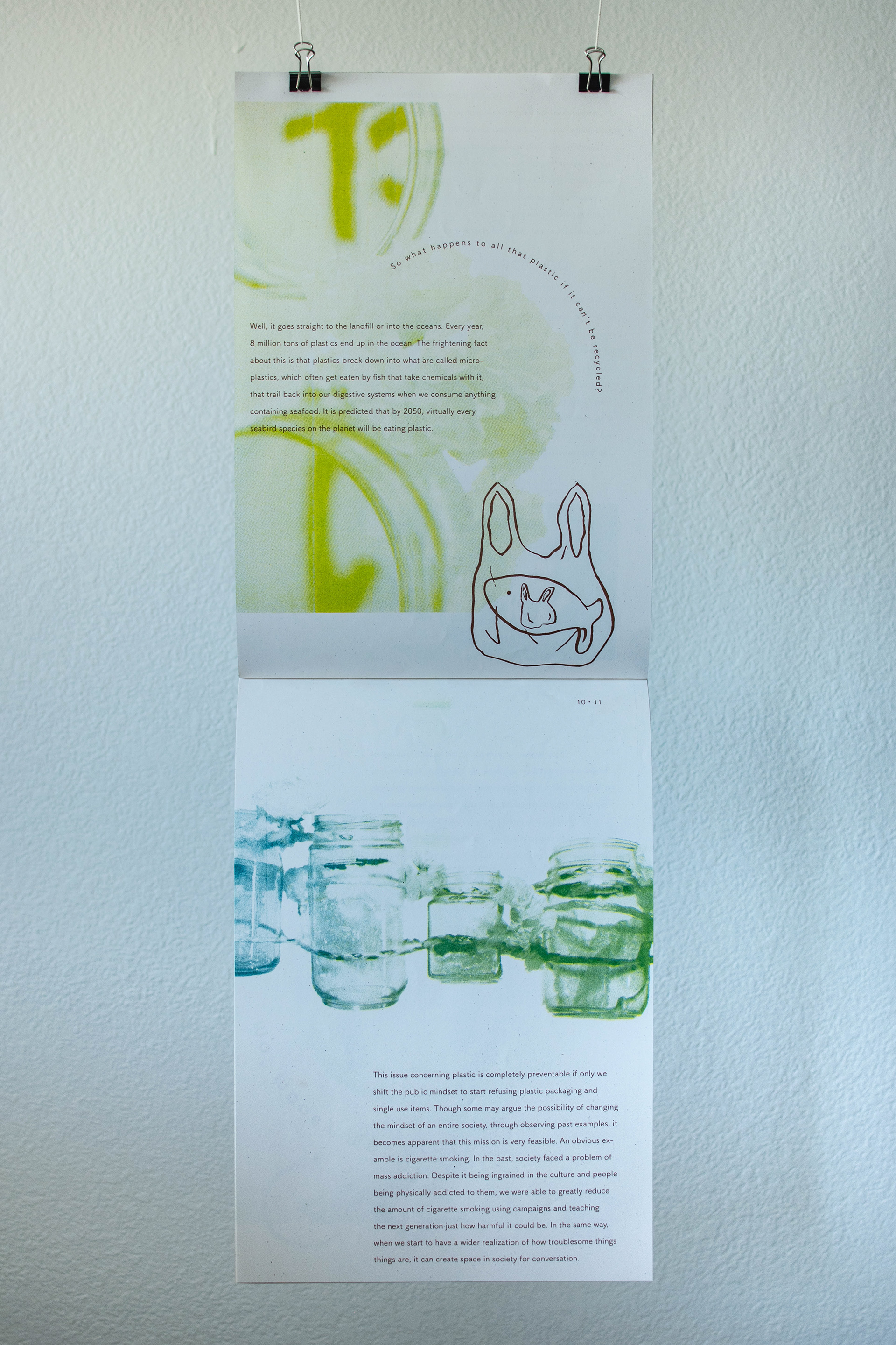
I started off by exploring a variety of subtopics under the subject of "waste". I then identified and grouped similar themes together to prioritize my findings and make sense of the information. After narrowing down to about 15 findings, I synthesized those ideas to communicate the detrimental effects of single-use plastics and consumerism have on our ecosystem.
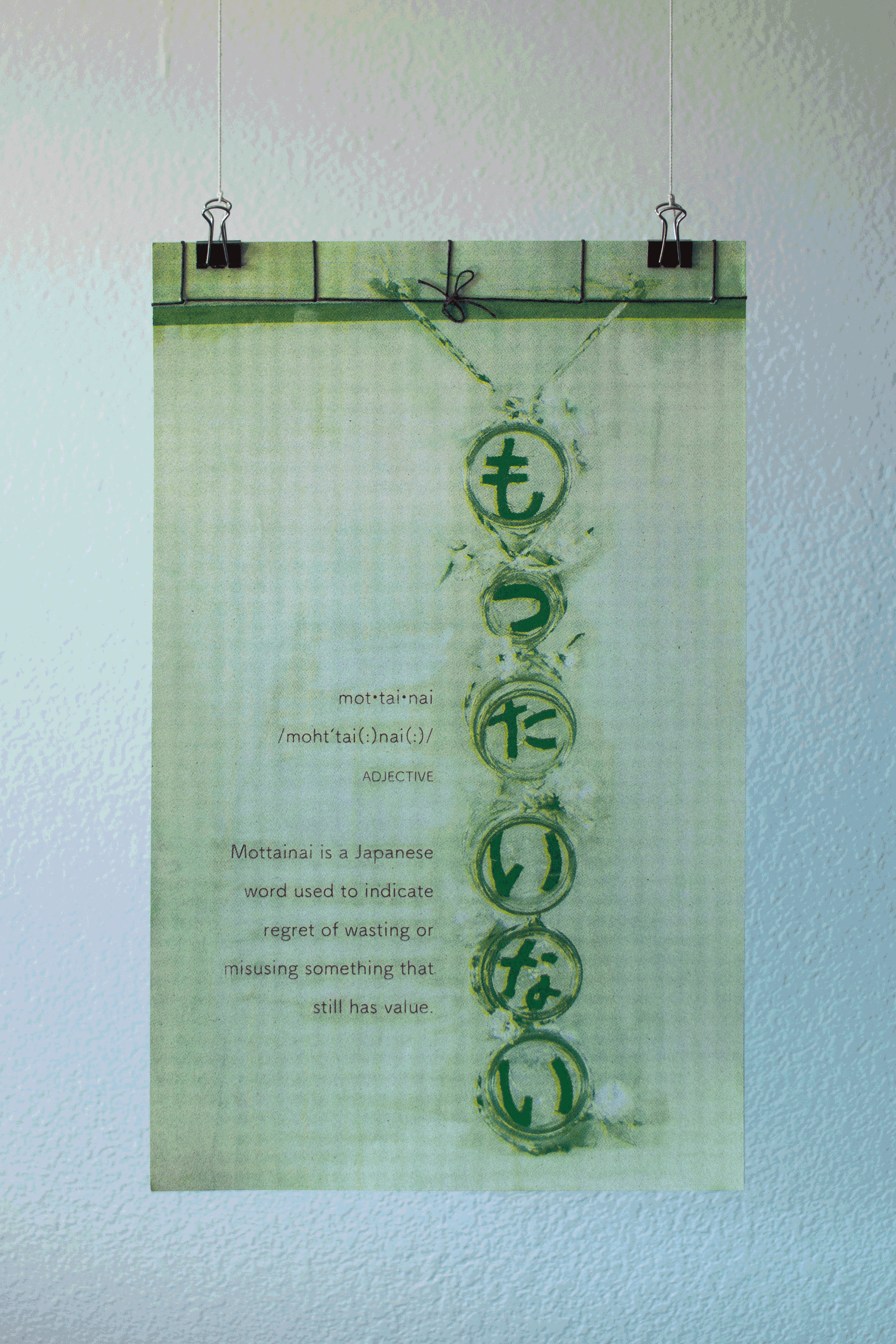
/moht’tai(:)nai(:)/ ✳ adjective
もったいない
A Japanese phrase used to indicate regret of wasting or misusing something that still has value.
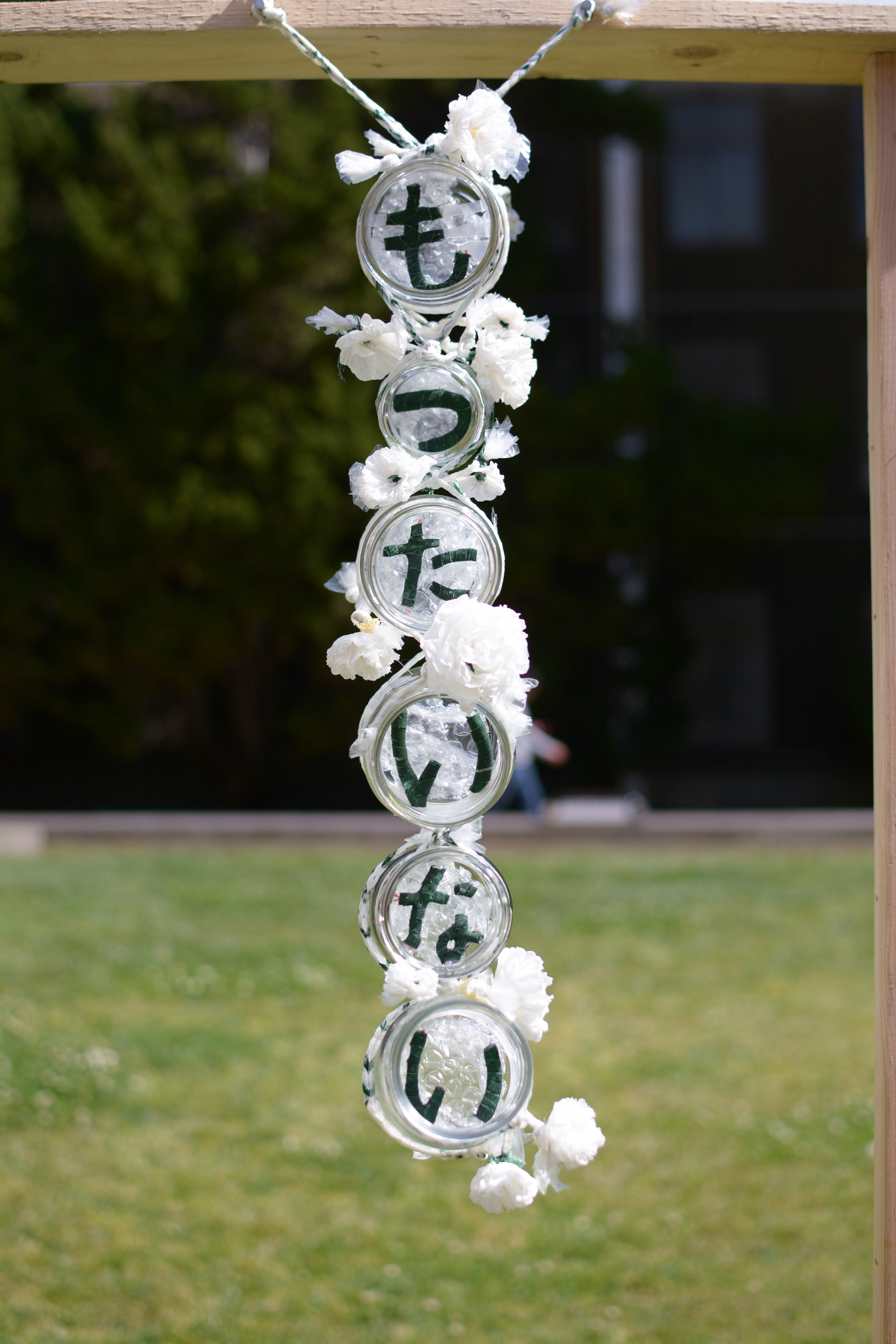
Part 1: Sculpture
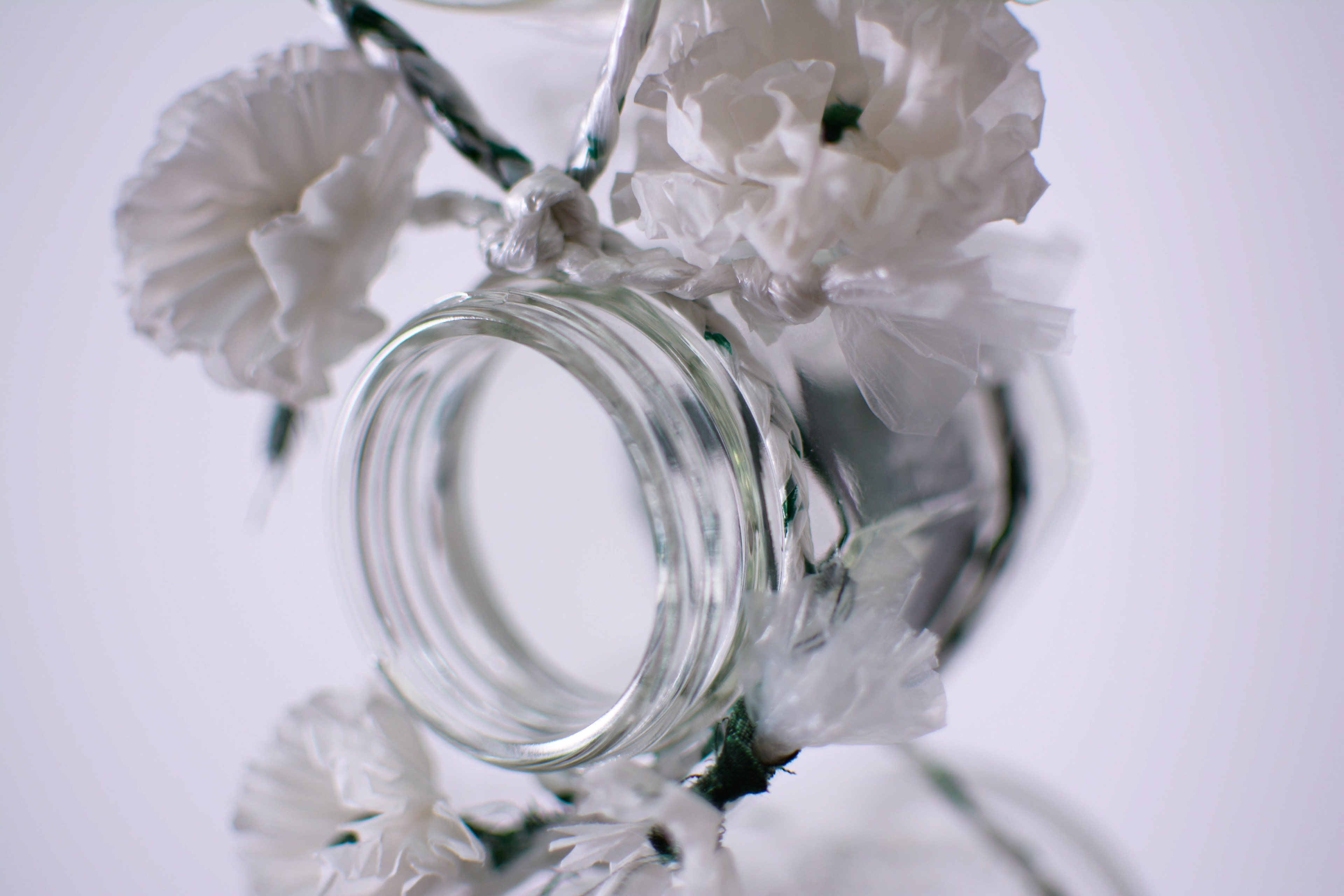
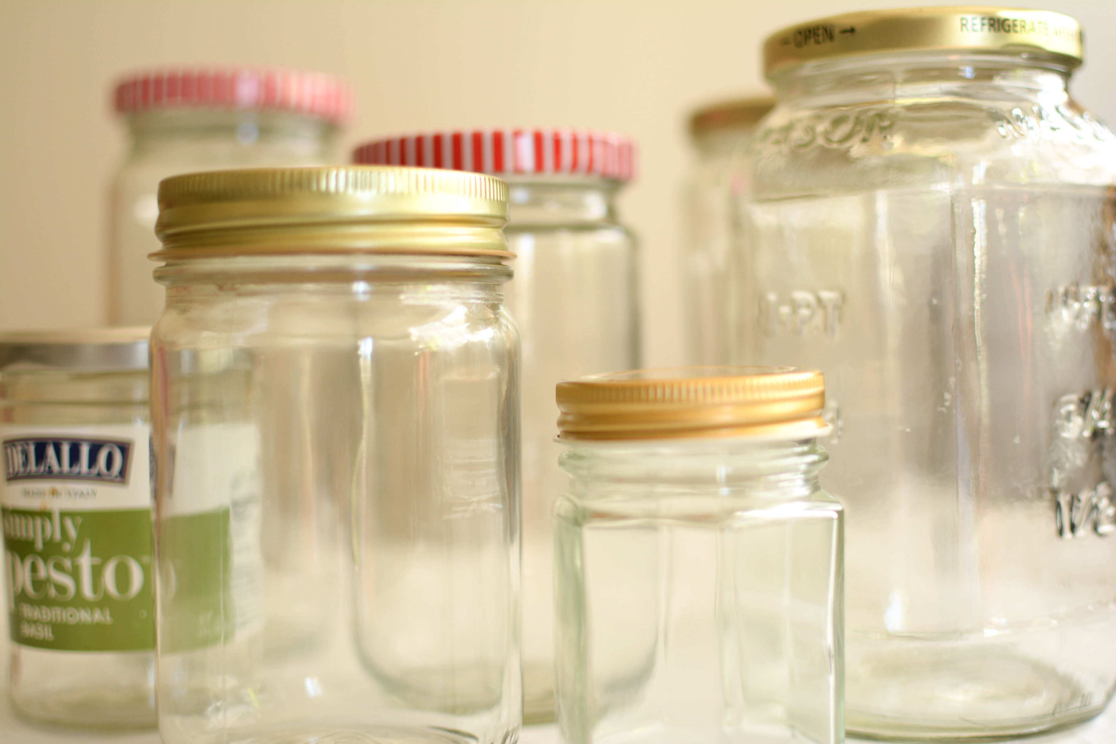
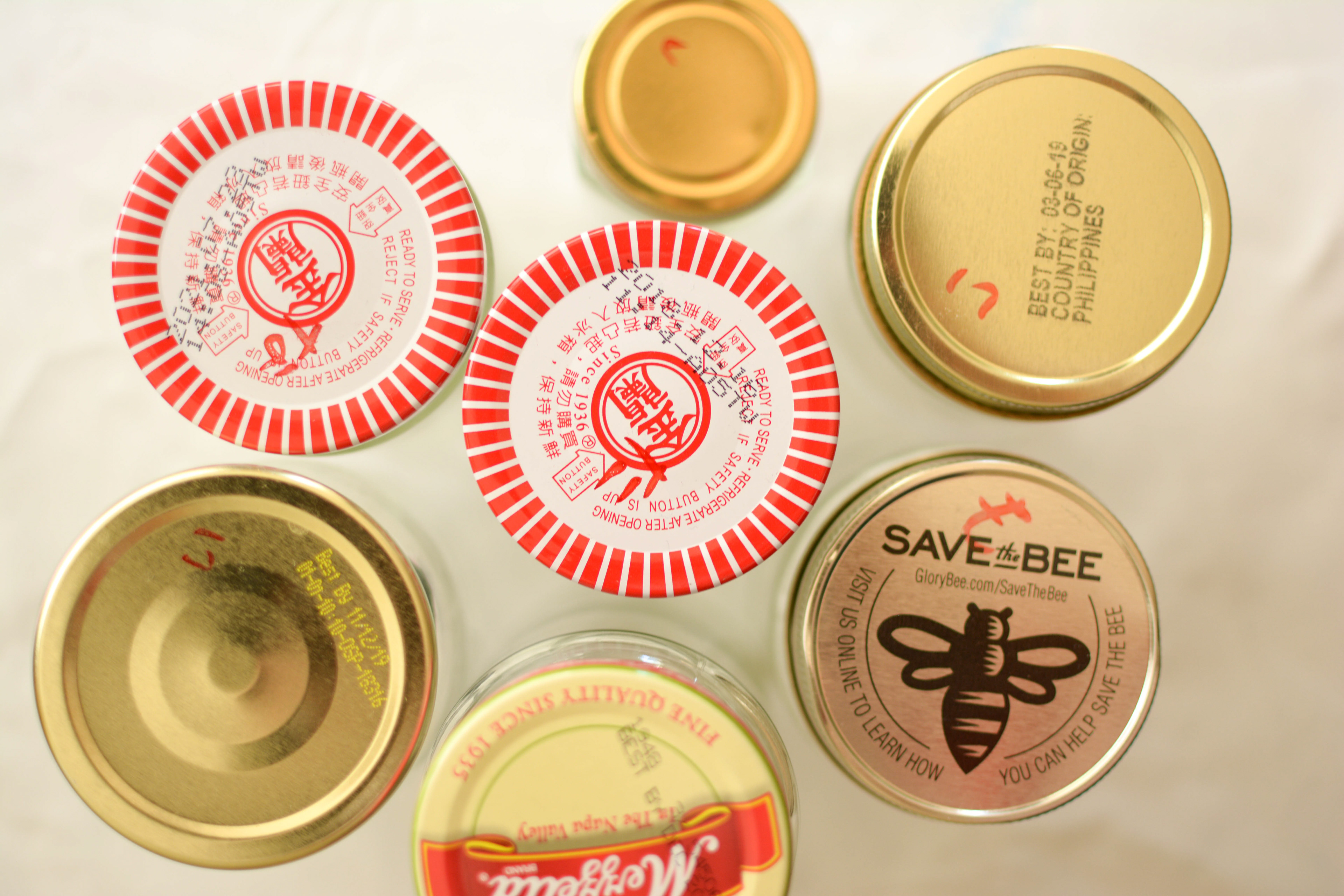
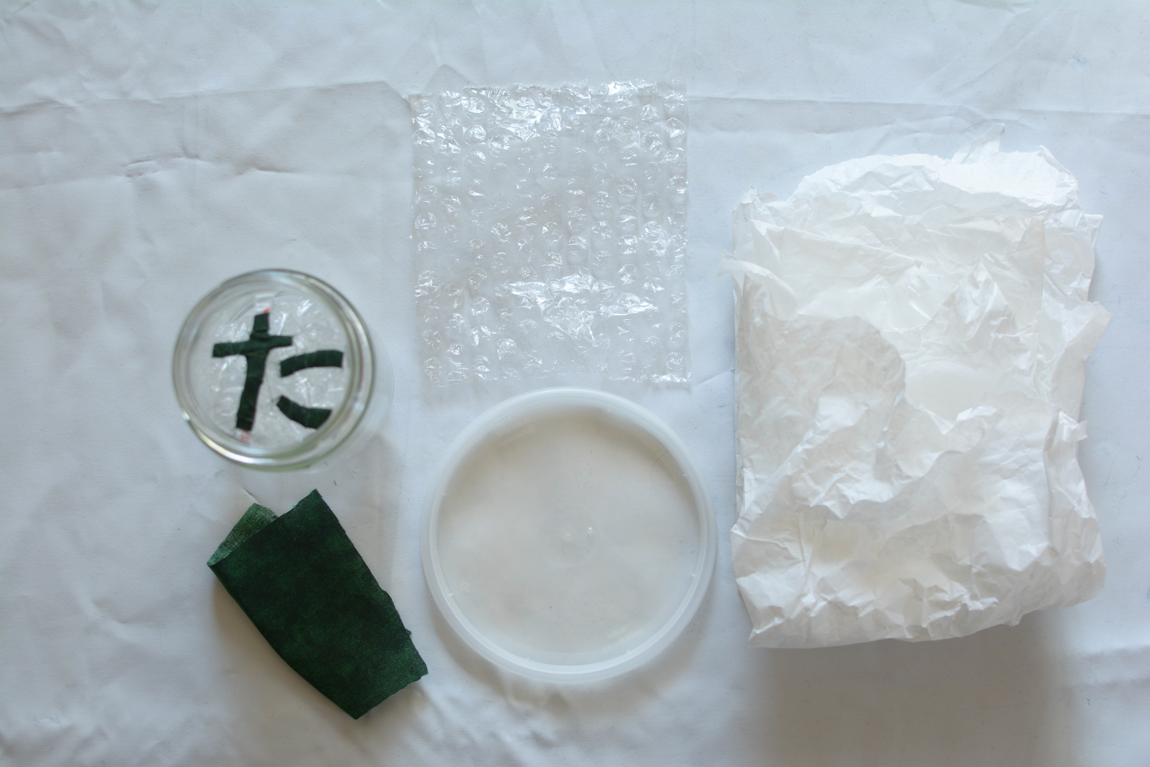
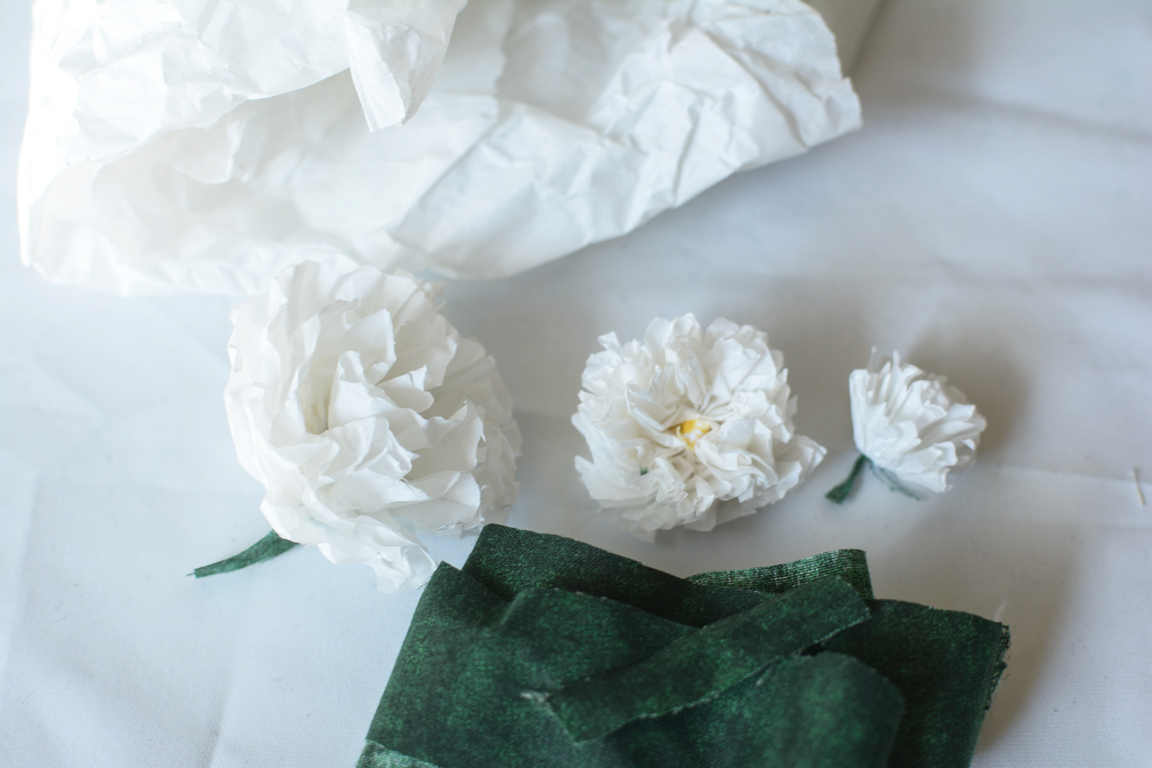
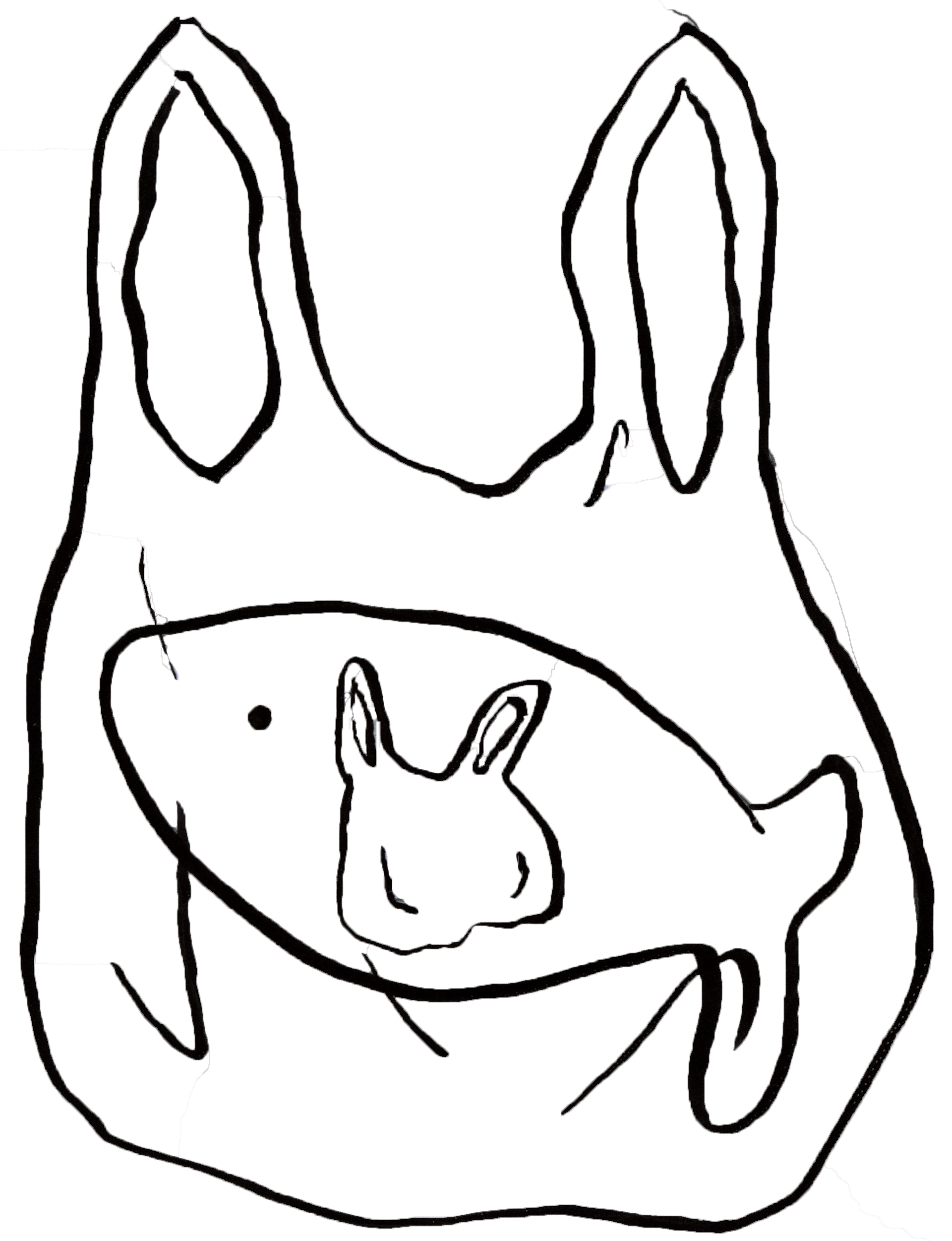
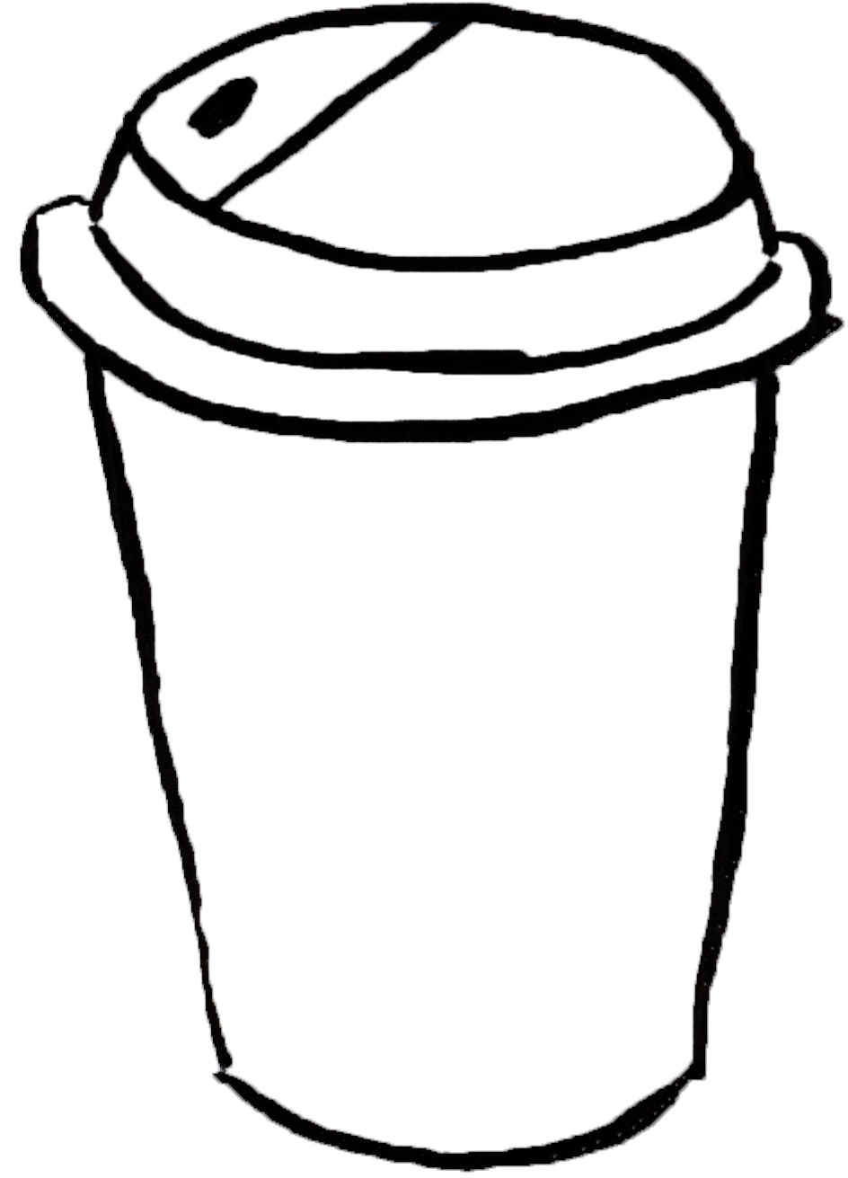
The goal for the first part of the project was to create a typographic sculpture using only single-use plastic waste. I collected various packaging materials such as jars, plastic bags, bubble wrap, and more. 「もったいない」/moht’tai(:)nai(:)/ is the Japanese word I chose to represent in my sculpture which roughly translates to "what a waste" in English. I chose this word because it is a clear, concise word that expresses regret over waste - a word that does not exist in the English language. The materials used to create this typographic sculpture are all made from single-use items: items that are unnecessarily disposable and inherently wasteful - items that are もったいない。
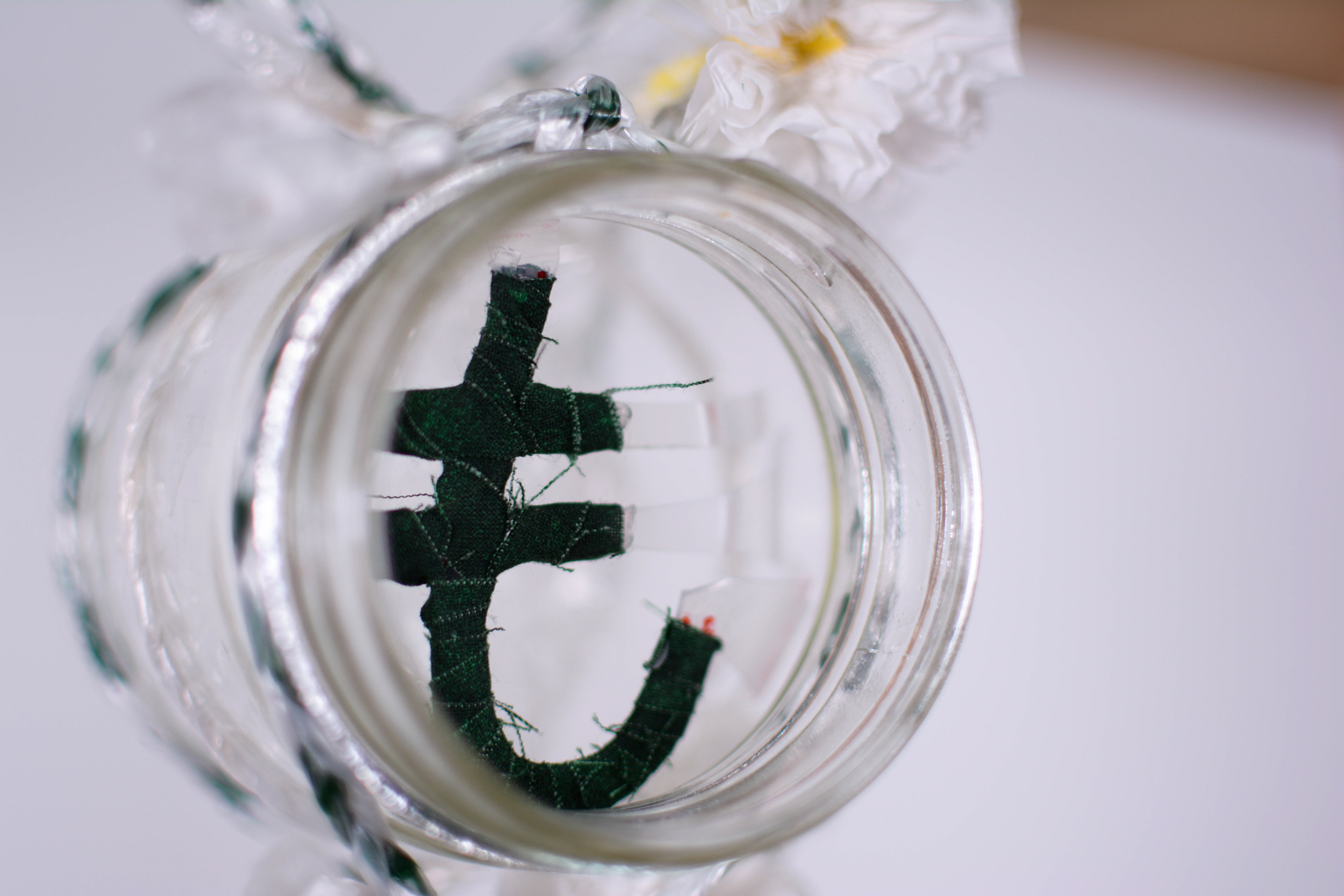
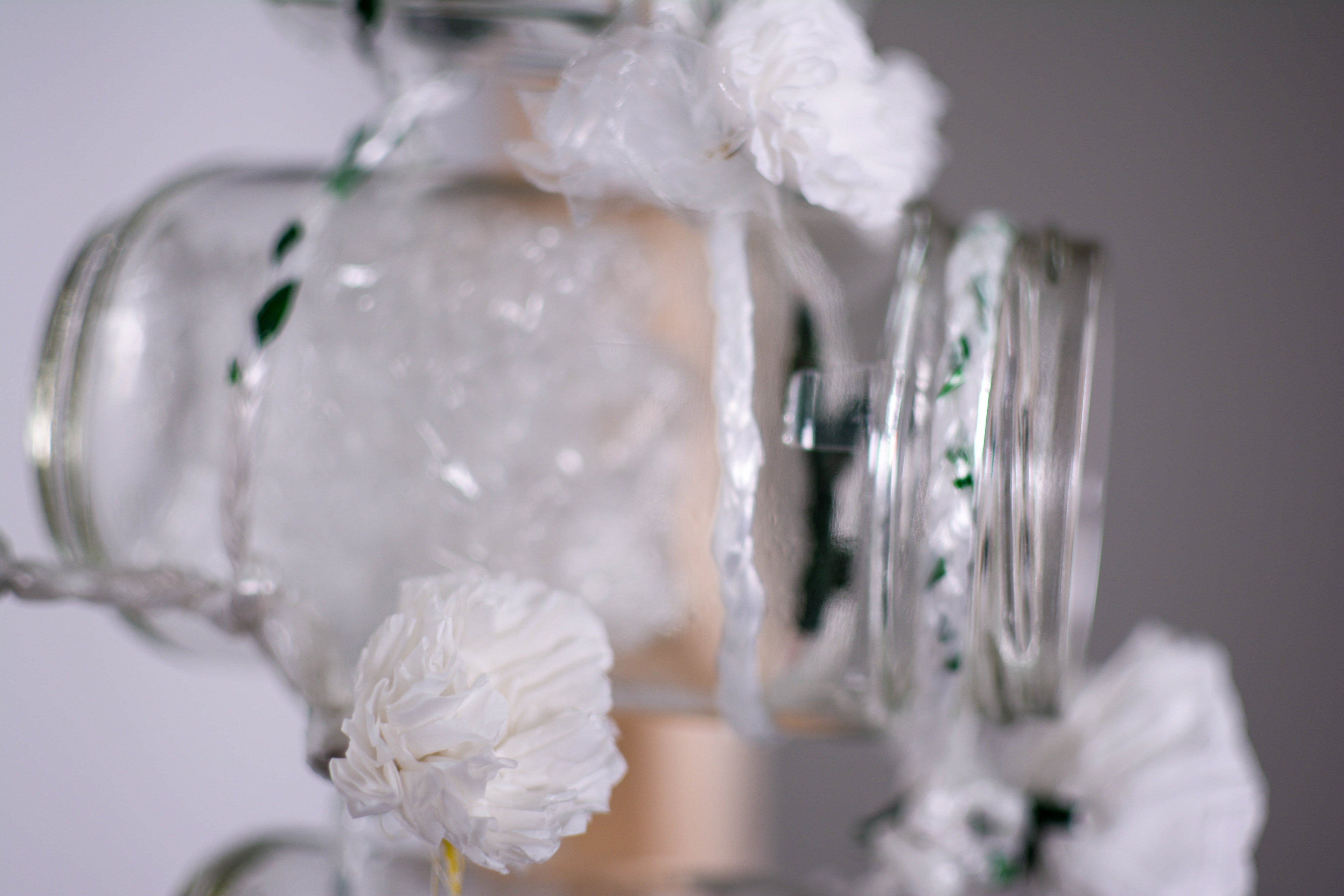
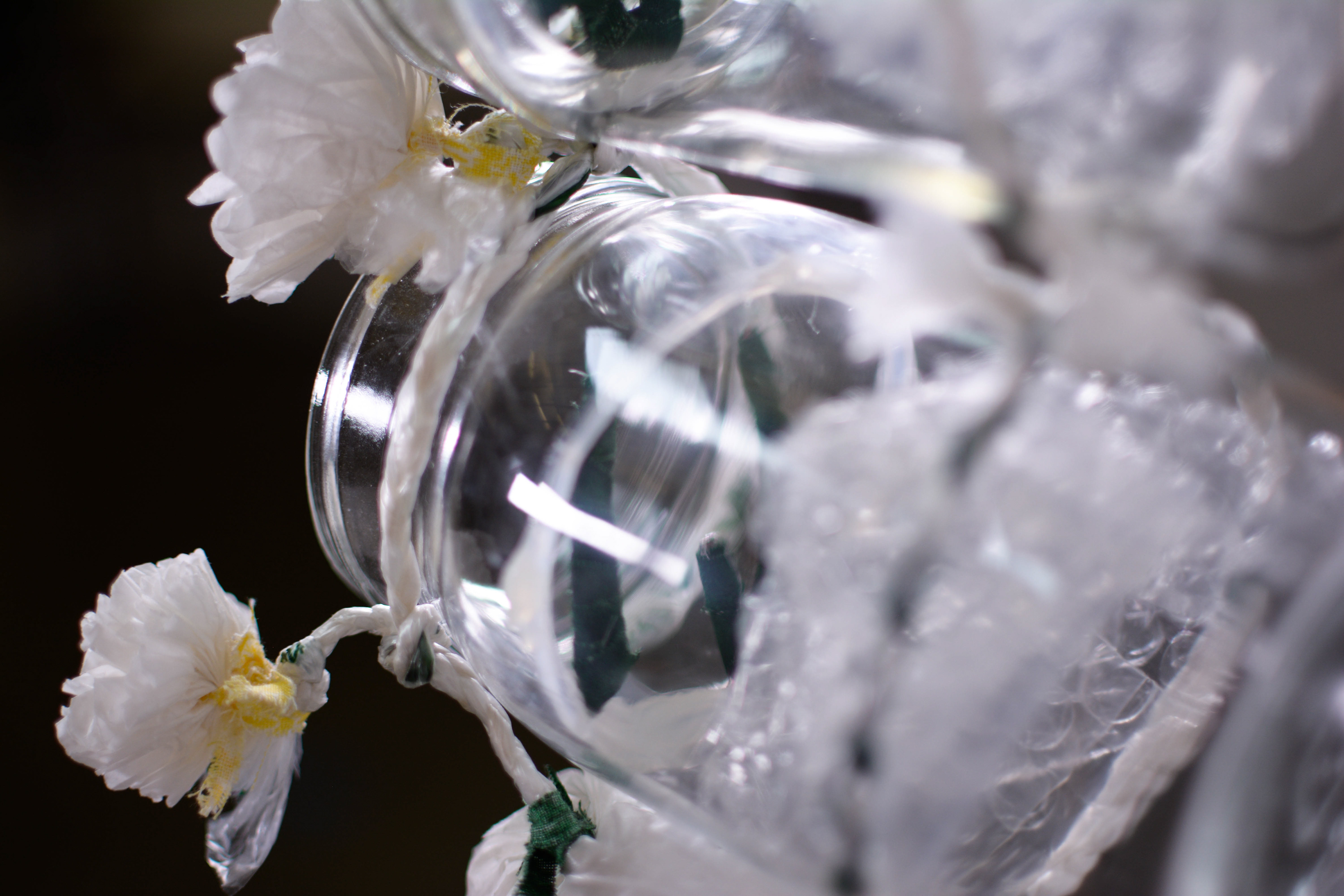
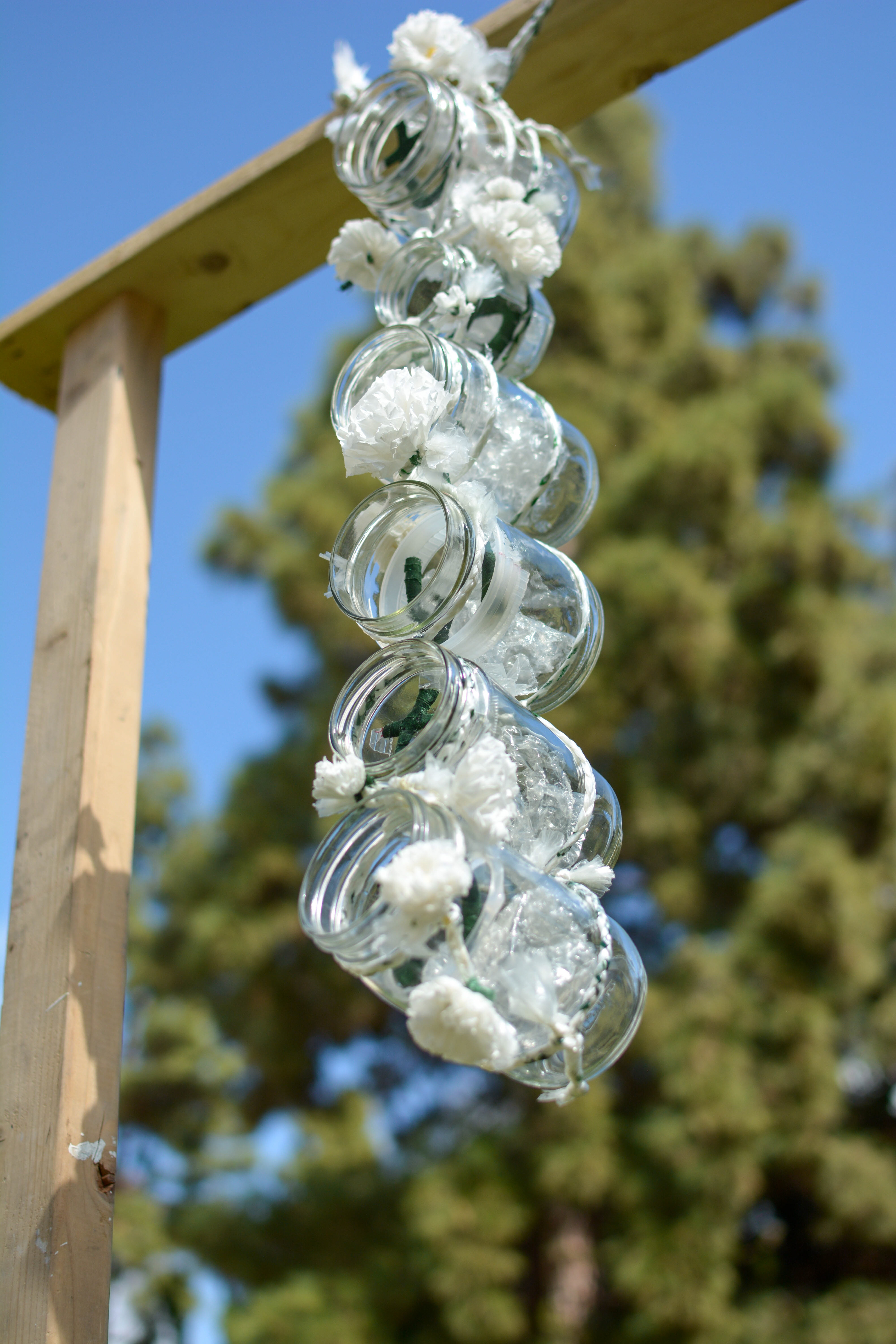
Materials
All materials were found materials in my apartment. I collected empty jars, tissue paper, bubble wrap, old takeout containers and fabric.
Part 2: Manifesto
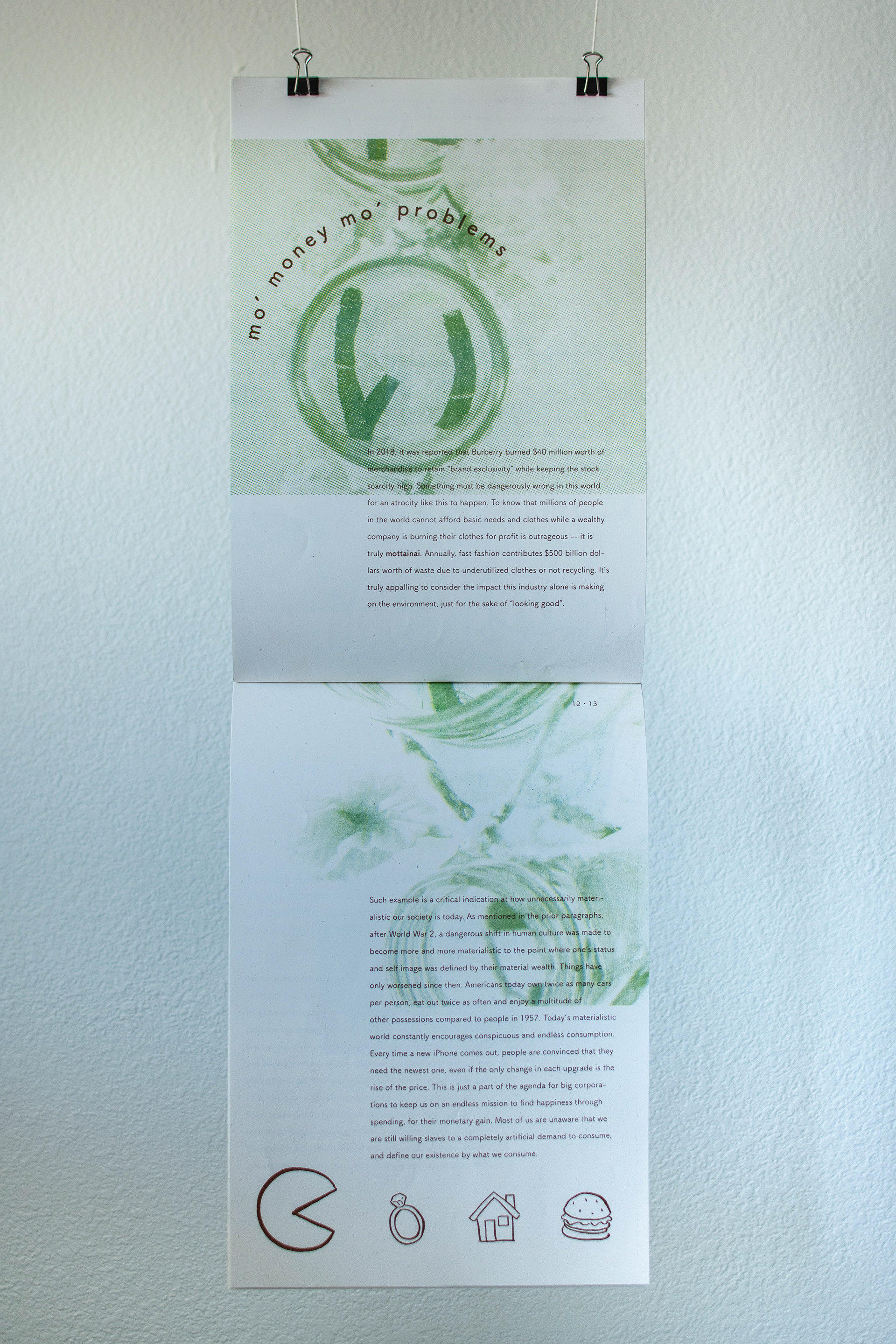
The manifesto's purpose is to accompany the sculpture and communicate all of my prior research using photography, type, and illustration. To further strengthen the concept of もったいない, I looked into the history of the word and usage in the Japanese Edo Era, and their sustainable methods. I ensured the visual language enforced the content of my writing by illustrating images with a calligraphy pen, using a minimalistic typeface to complement the photos and content, and using a Japanese stitch to bind the piece. Typographically, I tied the circular shapes of the jars with the concept of circularity by embracing all the round shapes where possible, creating a system of Rounded headlines.
Finally, the entire manifesto was printed on a Risograph Printer which added to the theme of sustainability, circularity and simplicity through it's unpolished, unpredictable colors.
Thank you