BR Baby is a capsule collection of baby and toddler clothing that was launched by Banana Republic in March 2022. To debut our newest sub-brand, we launched a 360 Marketing Campaign across all of our channels.
As the lead designer, I designed all digital assets including the Landing Page, Digital Billboards, In-Sort-Marketing Banners, Emails, and App assets.
Credits
Lead Designer: Mina Malloy
Creative Director: Melissa Laux
Associate Creative Director: Nate McCain
Copywriters: Chris Lawrence, Kim Friday
Creative Director: Melissa Laux
Associate Creative Director: Nate McCain
Copywriters: Chris Lawrence, Kim Friday
Area of focus
Web design
User Interface design
Interaction design
Wireframing
Rapid prototyping
User Interface design
Interaction design
Wireframing
Rapid prototyping
Objective
Create an immersive experience across all BR touchpoints that attract new customers and convert existing customers into Baby shoppers through our unique quality and value proposition. We were to highlight the functionality, luxury materials and sustainability of the products -- and focus on the emotional connection that last with customers on their journey to parenthood.
Imagine the places they'll go.
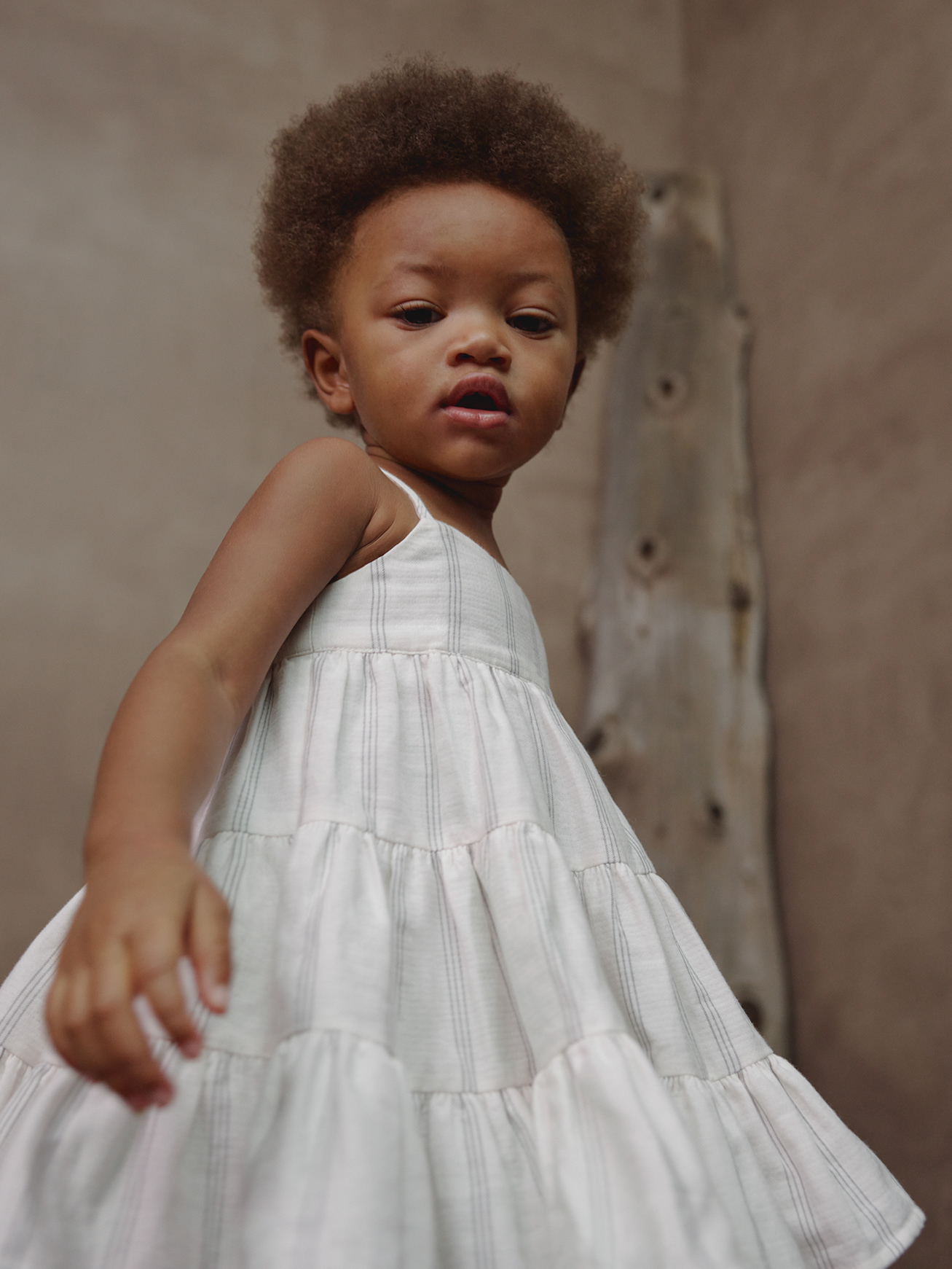
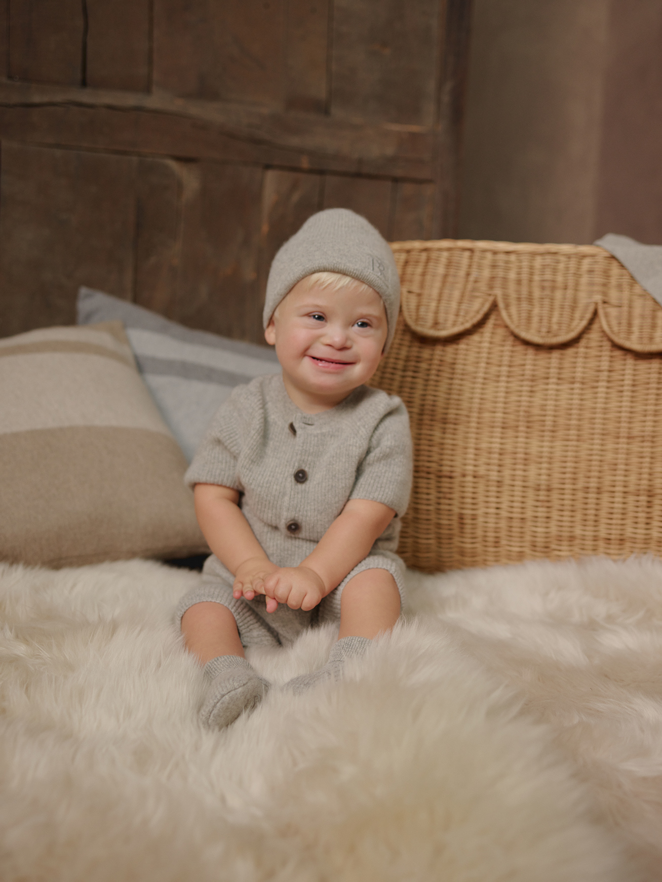
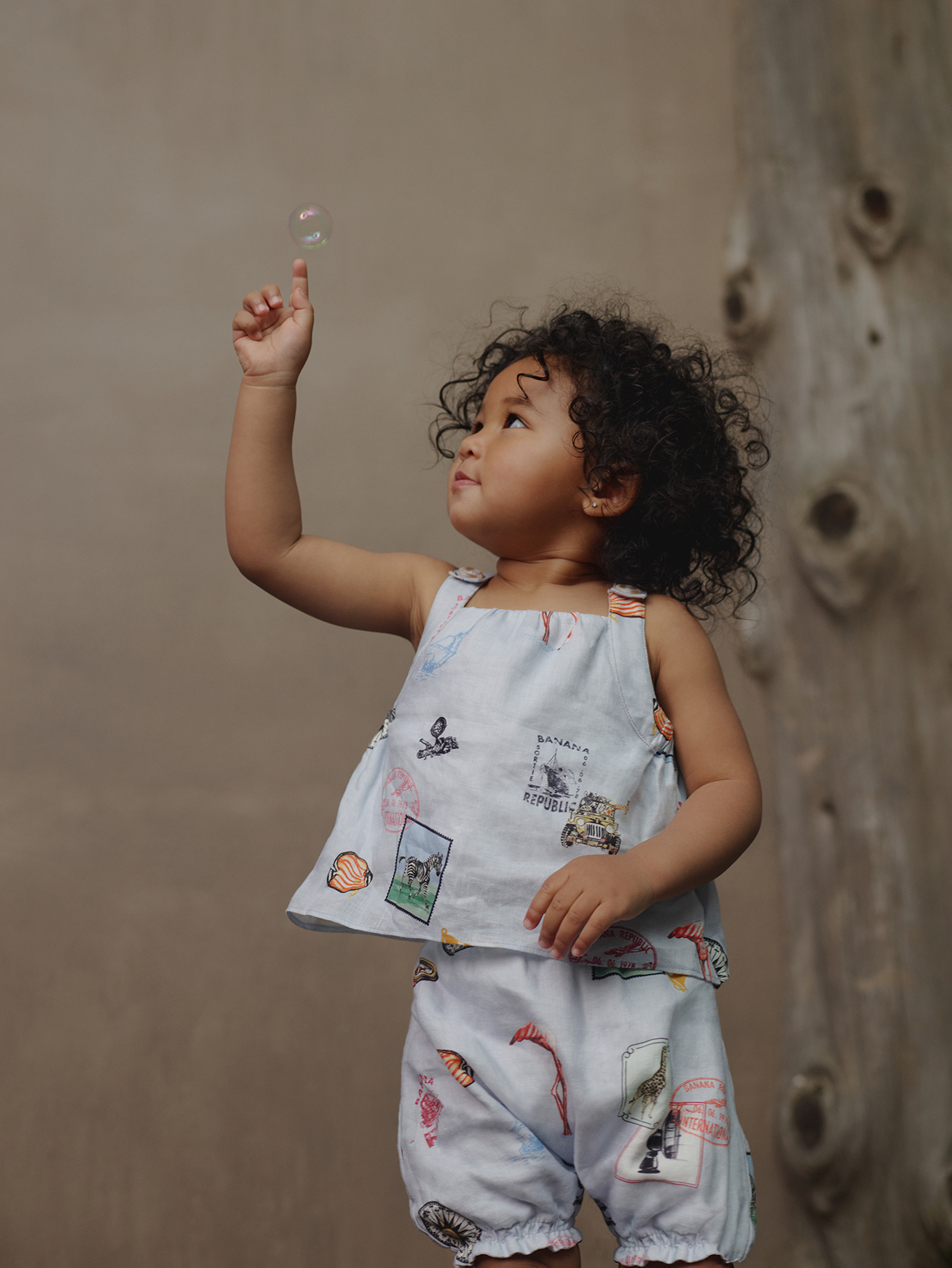
Email Designs
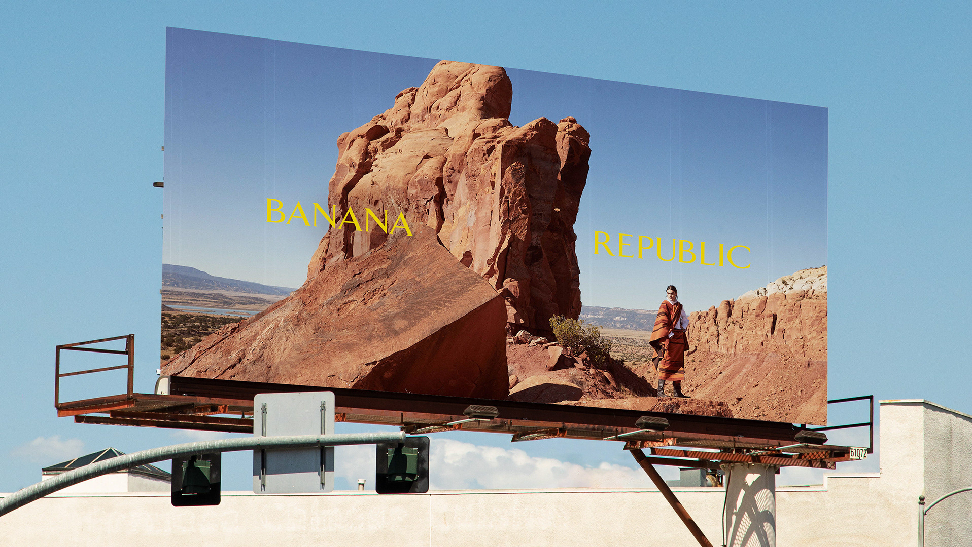
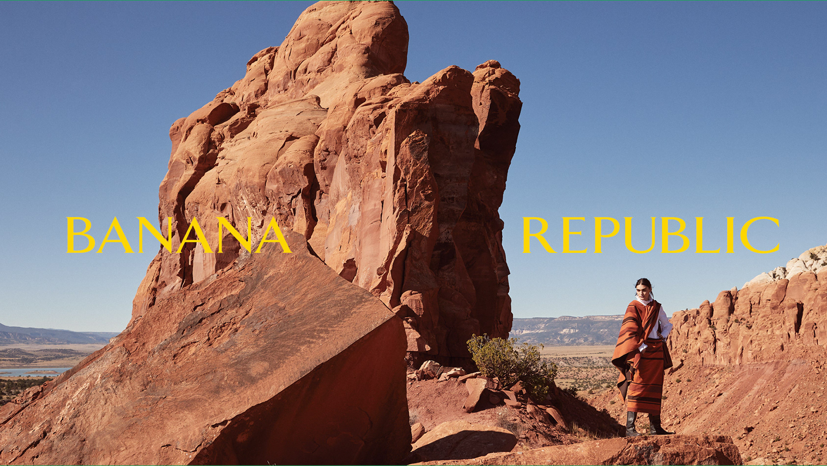
Digital billboards + In-sort-marketing banners Link to website ↗
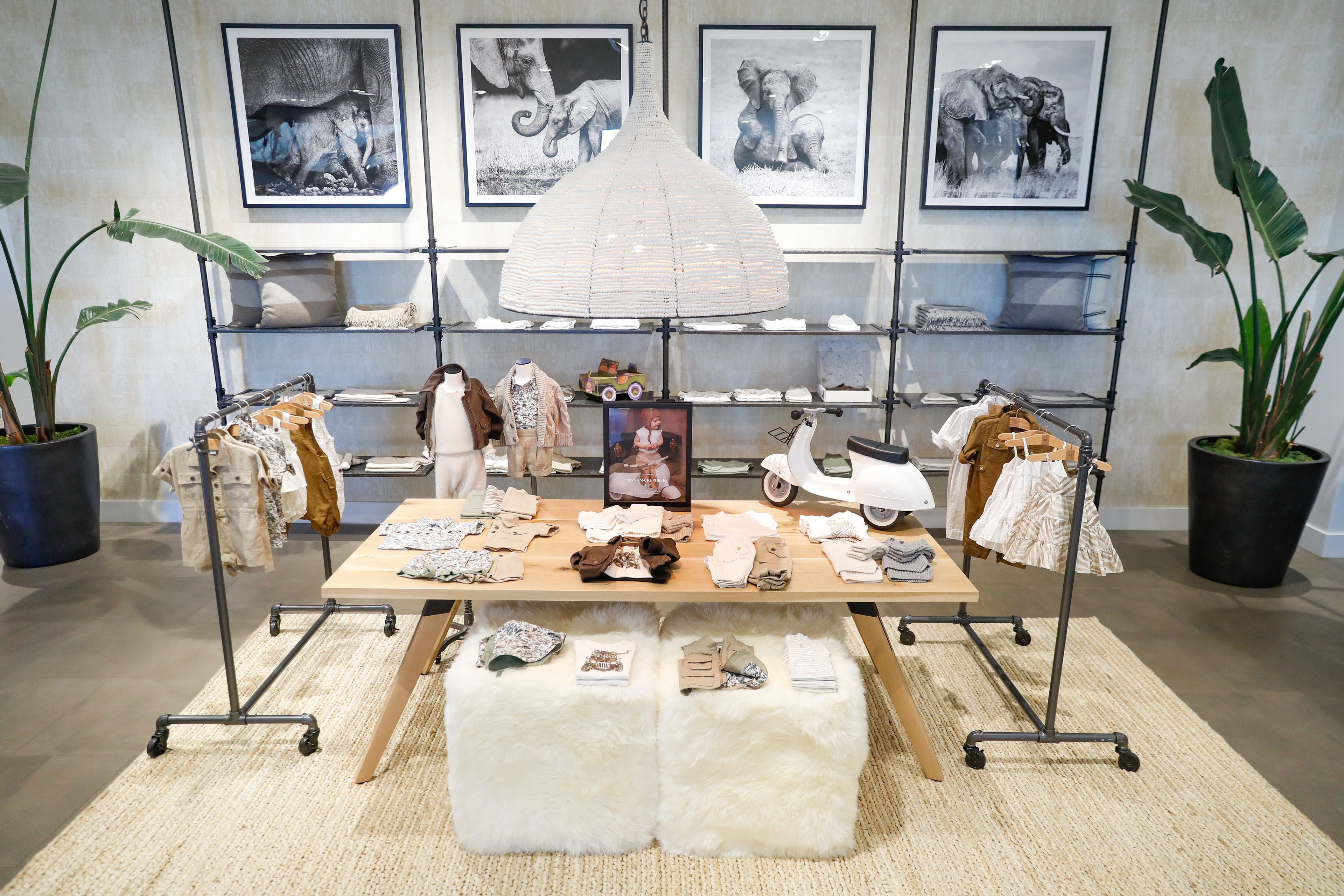
Store Set Up
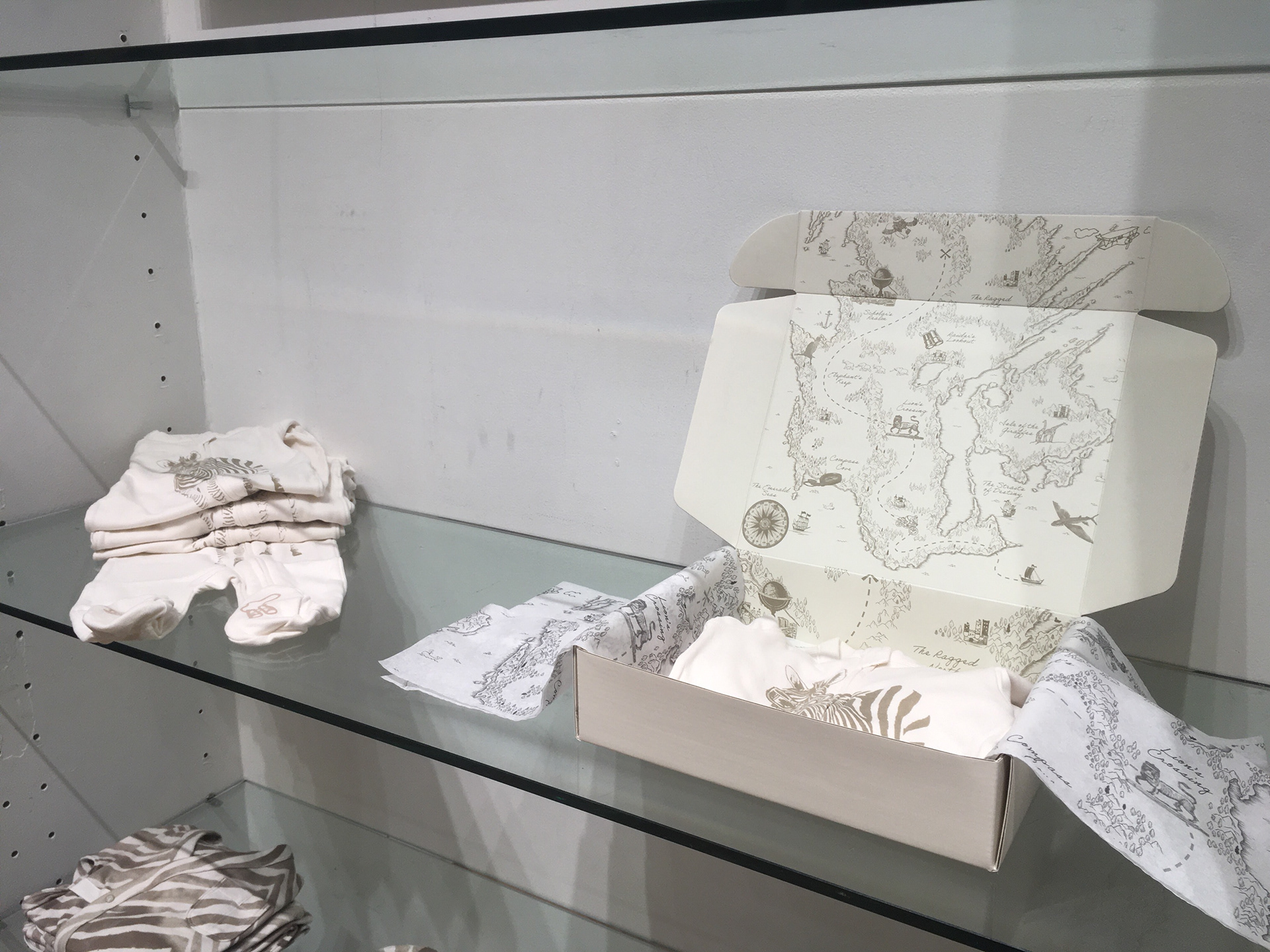
Packaging
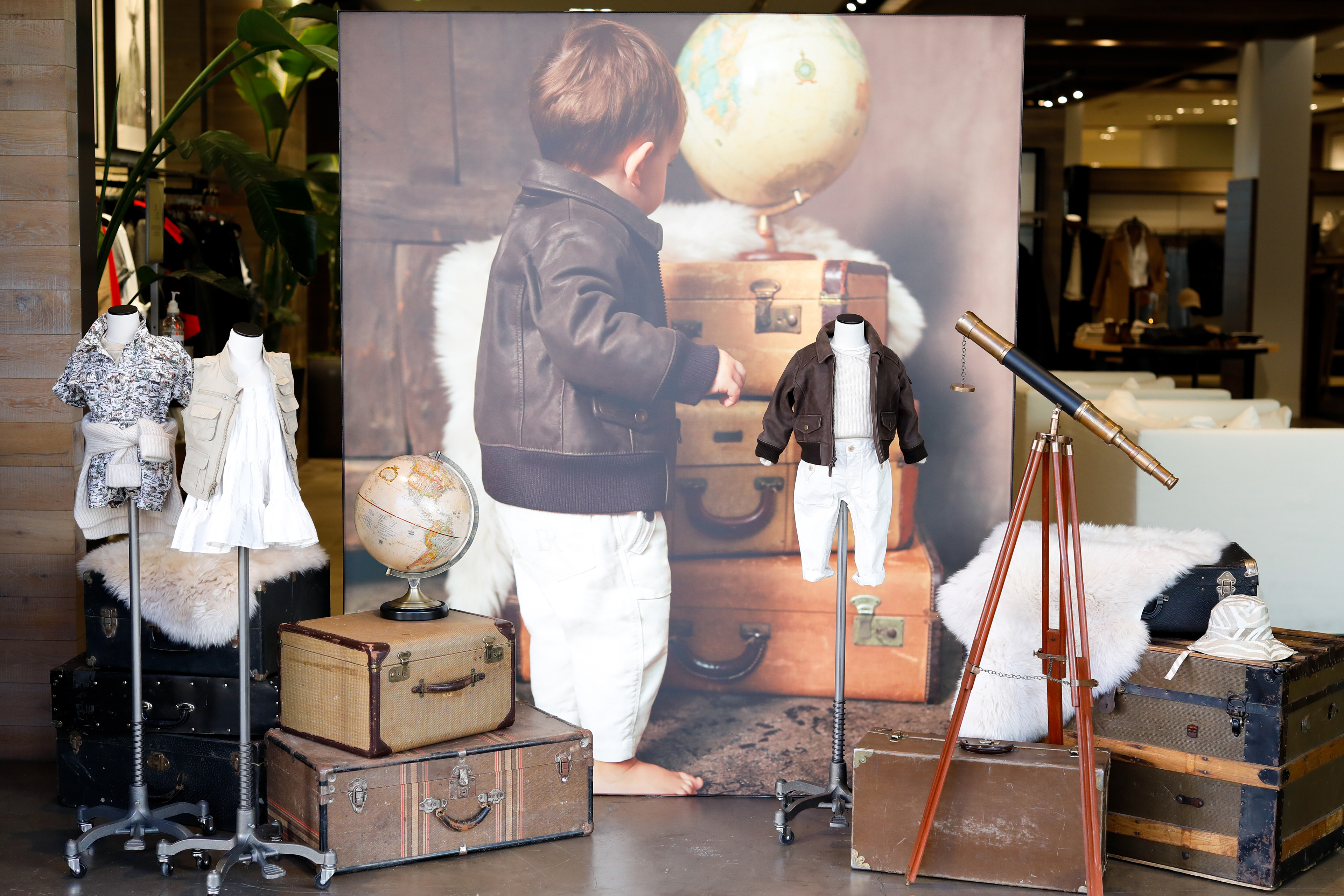
Store Signage
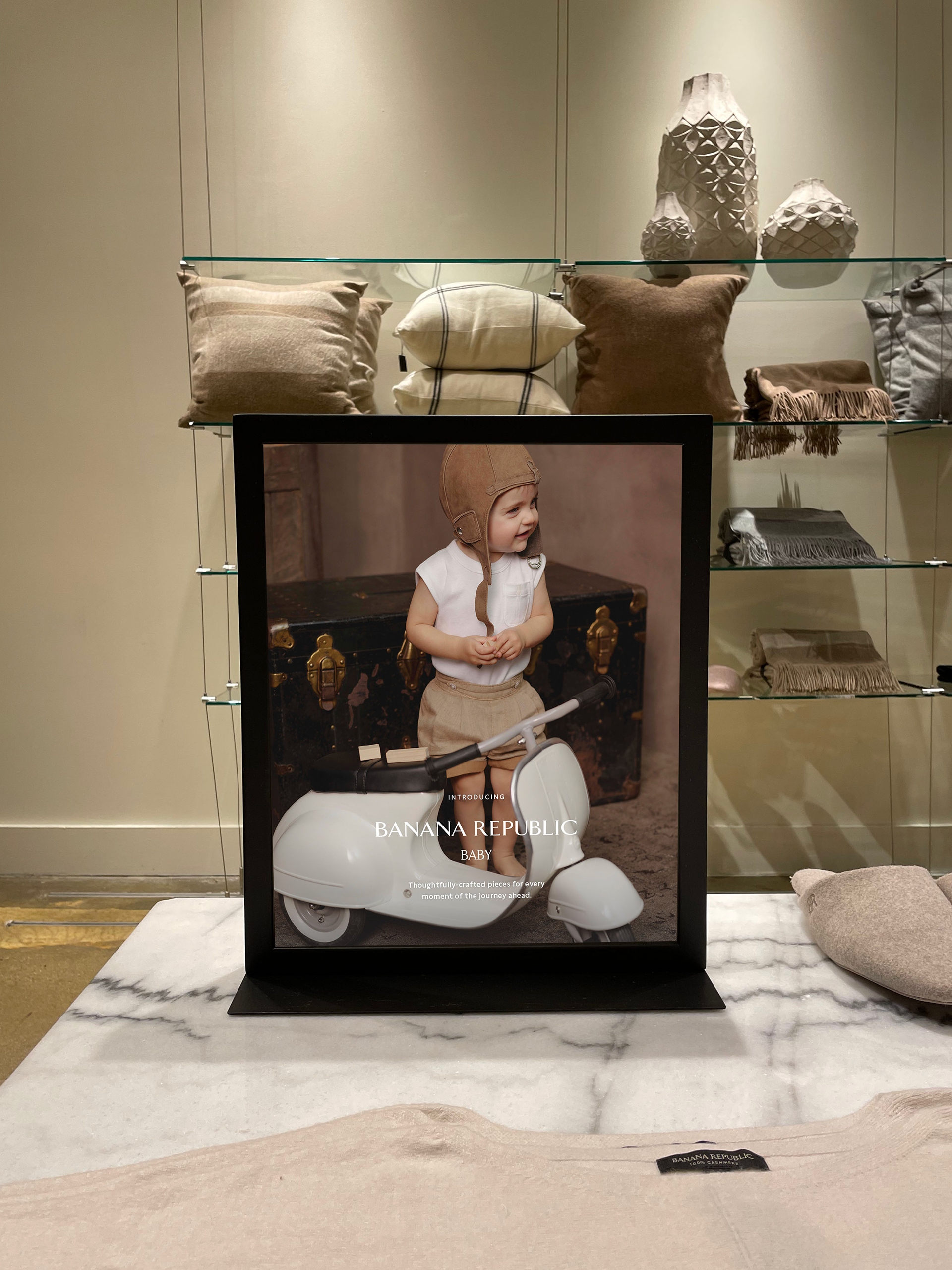
Store Shadowbox
Process
How did it come to life?
Discovery ⟶ Synthesis ⟶ Design ✴
Discovery
From early on, it was decided that the landing page would set the tone for the rest of the campaign as it was a high-visibility page. To get a feel of the competitive landscape, I pulled some swipe from our other brands in the retail space, and took a look at the way the story is told through the pairing of imagery, composition and typography.
Sketches/wireframes
We then proceeded to lay out the basic placements of image and text. Looking back at our brief, our goal was to create an immersive and emotional experience that connects with new parents.
How might we evoke an emotional connection that lasts with customers on their journey to parenthood?
Some ideas that we came up with:
✳ A landing page that mimics a growth chart that is commonly found in a child's room to measure their height.
✳ Elements of physical photographs to capture the precious memories of early childhood using polaroid frames.
✳ Using a parallax effect to make it appear that photographs are floating by, creating an immersive experience that shows a passage of time.
Mock up
While creating our wireframes, we made sure to discuss feasibility with our developers while also getting feedback from our cross-functional partners on the design. This is where we carefully considered the dynamic between imagery and typography. Taking into consideration the look-and-feel of the images themselves and creating a layout that compliments the emotional imagery.
At the end of the landing page, we included a manifesto that conveys the "why" of this capsule collection. For this section, I designed a layout that feels like an opening of a children's fairy tale novel. Using the drop-cap to romanticize the copy, I leveraged patterns from the physical product and included the illustrations to create a whimsical and playful scene.
Thank you
