Desktop app design
Talent Sourcing Platform
June 2020 - July 2020 (4 weeks)
Designing the employer's on-boarding experience of a career building platform for international students.
Together, Corey and I designed the employer-side of the platform based on some given brand guidelines. I was responsible for the employer onboarding experience up to the dashboard.
Credits
Designer: Mina Malloy
Designer: Corey Dong
Designer: Corey Dong
Area of Focus
User Research
Interaction Design
Wireframing
Rapid prototyping
Interaction Design
Wireframing
Rapid prototyping
⚠️ Due to a Non-Disclosure Agreement, information on this project is limited.
What is TSP?
The Problem:
International university students often face many difficulties that inhibit them from smoothly navigating their career search in the United States. From obtaining sponsorship to cultural differences - it can be tough for students to find their way without a guide.
The Solution:
Talent Sourcing Platform (TSP) is a platform that connects job-seeking international students to talent sourcers at large companies. TSP’s student portal provides international students with data-informed insights and resources to help them transition and thrive as they navigate their careers abroad. At the same time, the employer portal allows recruiters and talent sourcers to track their posted jobs and interact with students to find top talent.
High Level Objective
Design an experience that enables employers to find international talent quickly and smoothly.
Approach
Scope and constraints
✳ The student portal had already been built out. Our assignment was to design the employer portal.
✳ This was an MVP so we needed to keep it as simple as possible.
✳ We had 4 weeks to conduct research and design mid-fidelity wireframes.
✳ As the employers looking for talent would typically be sitting at their desktop computers, it made most sense to create a desktop web app.
Defining Users & Goals
Who are we designing for?
Before jumping into design, we spoke directly with some campus recruiters to get a better understanding of their needs and inspire our designs. Some questions we asked were:
✳ How do they recruit students?
✳ What are they looking for when recruiting talent?
✳ What challenges do they face when recruiting students online?
Pain Points
➜ Current ATS systems do not provide a holistic view of all schools of their talent pool and recruiters have to manually analyze the information per school.
➜ Recruiters oftentimes have to repost jobs with very similar responsibilities or qualifications. They have to manually type in job responsibilities every time which can be cumbersome.
➜ Sifting through the qualifications of each candidate can take away time from actually evaluating the candidates based on their competency.
📌 Challenge: Because of the amount of time we had, it was not possible to address all the pain points. We needed to prioritize based on our MVP scope, and determined that the first pain point should be the main focus.
User Flow
How we kept the experience simple
Once we got a general understanding of what employers would need on this platform, we laid out the flow to ensure that we keep it as simple as possible.
We divided the project into two phases: the Onboarding and the Portal.
Design
We adhered to these design principles to keep our team true to our brand guidelines.
Onboarding
Goals
01 Enable the employer to sign up and get to our core value as quickly as possible.
02 Request the right (and only the necessary) amount of information at the right time to reduce cognitive load.
03 Set expectations appropriately so the employers don't end a lengthy signup process in disappointment and frustrations.
Before we jump into it, here's the entire onboarding experience in one video:
Ultimately, we split the onboarding process into three parts:
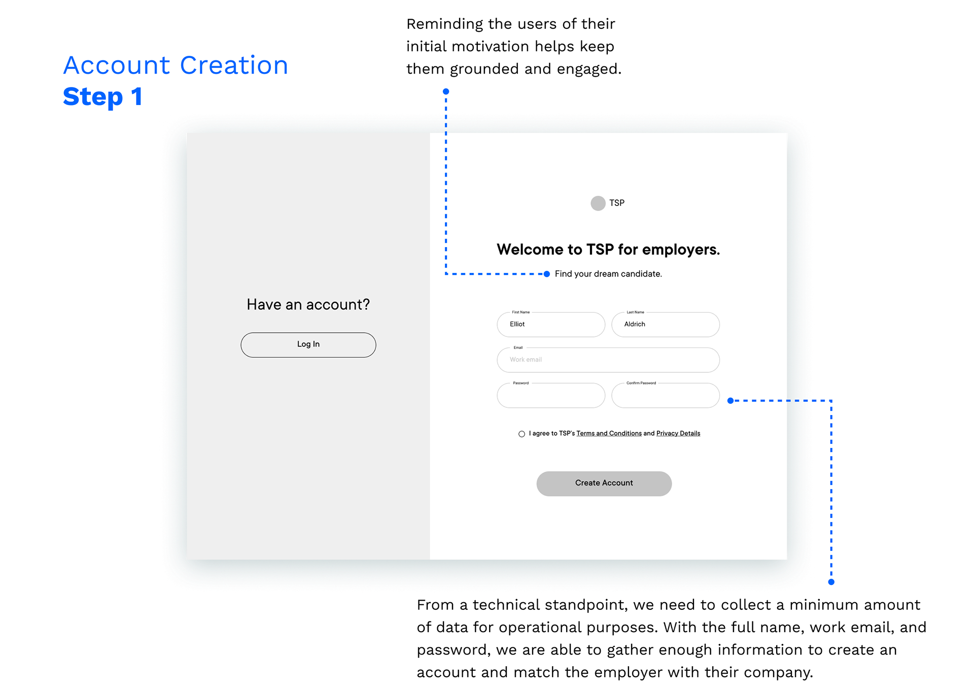
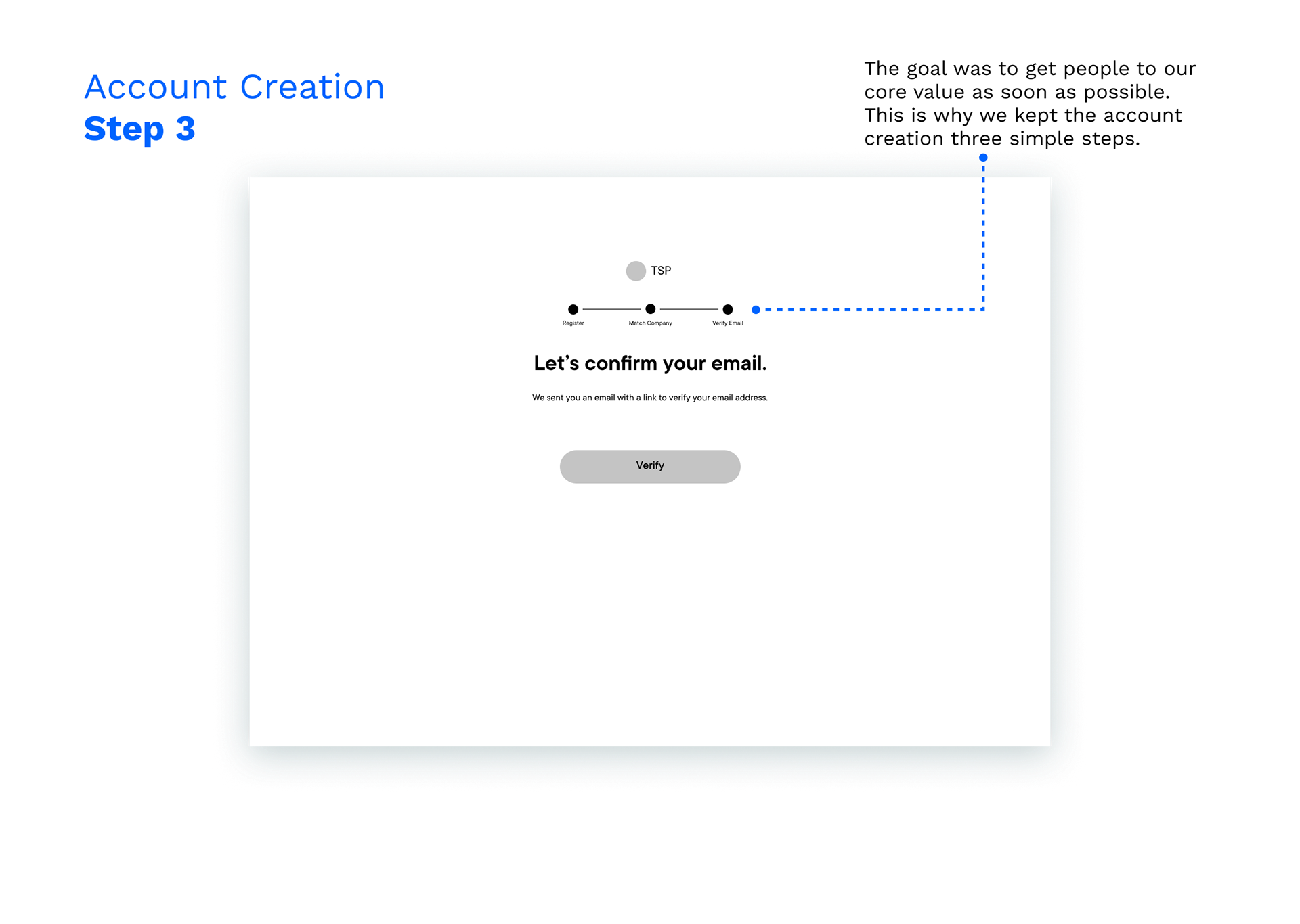
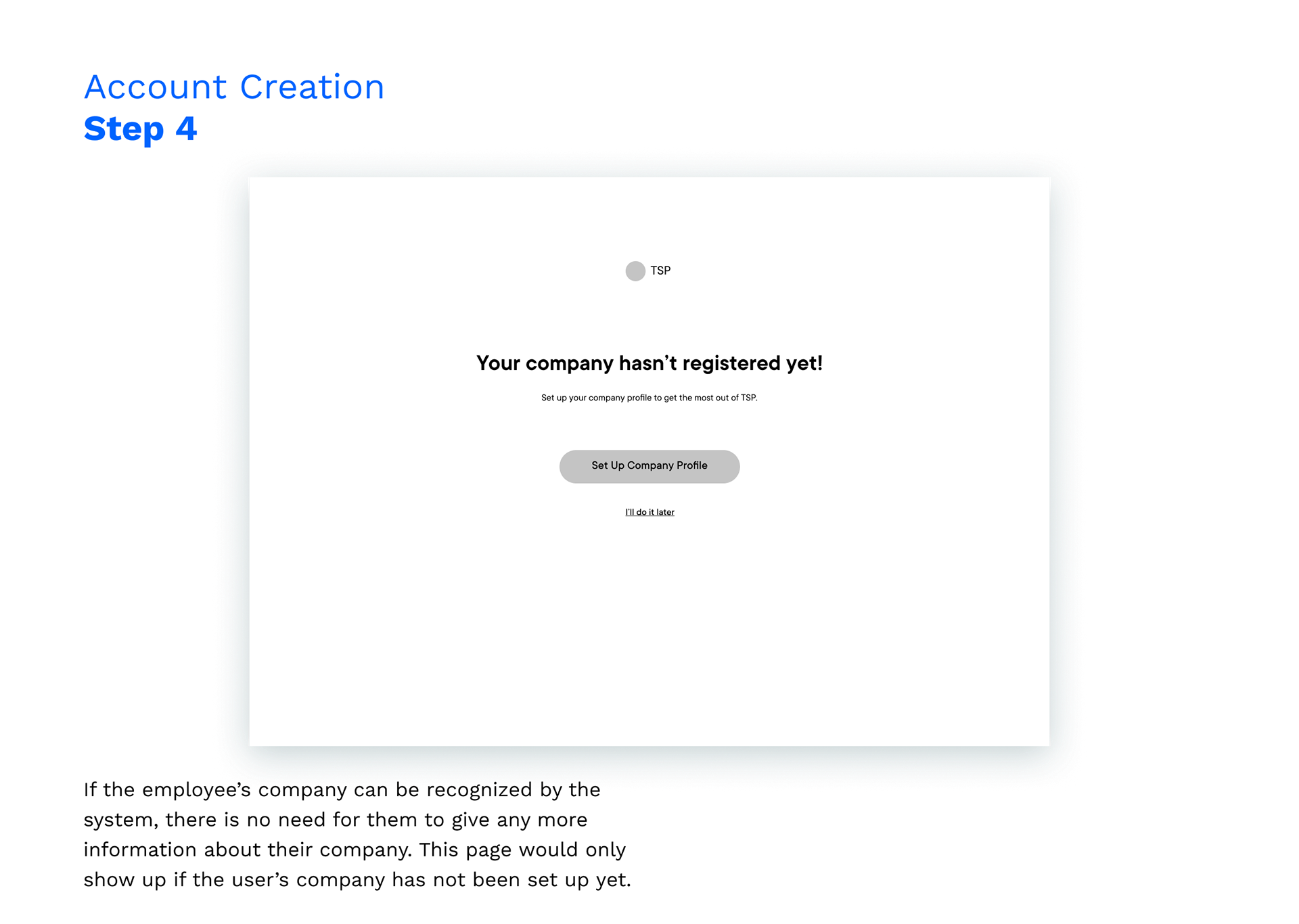
1. Account Creation
To get people to our core value as soon as possible, we made sure to only require the bare minimum of information to initially create an account. Below are the 4 simple steps to create an account. (Click on the images to see the details)

2. Company Setup
Users would need to be associated with a company to start posting jobs and utilizing the platform, so it's crucial to link their accounts with a company profile. By keeping the similar wizard format of requesting information, and reducing it to three steps, they would be able to smoothly set up the account and begin finding top talent.
3. Employee Setup
The Employee Setup was the last of the three steps because it is not mission-critical for the user to include their social media channels and availability to post a job as long as their name and email were logged in the first step. However, setting up this information would help the user engage with students much more efficiently, so we included it as part of the onboarding process.
Portal
Goals
01 Make it scannable. A dashboard should be able to quickly provide bite-sized information.
02 Require minimal cognitive load to post a job so the employers can focus on evaluating the candidates.
03 Keep a flat navigation and reduce the number of clicks to enable the employers to efficiently keep track of their jobs and candidates.
Here's an overview of the employer's experience in the portal:
📌 As outlined above in the user flow, the Events and Messages pages were saved for a future iteration as it did not fit within our scope.
1. Dashboard
The dashboard includes bite-sized information of all the elements the employer is tracking. This is where they can find high-level information.
1
We had first designed the left panel to be expandable and collapsible, but after reevaluating the scope, we decided to make it static as it doesn’t directly achieve our MVP goal. A collapsible side panel would mean that designers would need to design two different layouts of each screen, and developers would have to implement it. Because this feature would cost more time and doesn’t directly affect the recruiter’s mission to attract top talent, we determined that it is a nice-to-have and put it on our backlog.
We had first designed the left panel to be expandable and collapsible, but after reevaluating the scope, we decided to make it static as it doesn’t directly achieve our MVP goal. A collapsible side panel would mean that designers would need to design two different layouts of each screen, and developers would have to implement it. Because this feature would cost more time and doesn’t directly affect the recruiter’s mission to attract top talent, we determined that it is a nice-to-have and put it on our backlog.
2. Jobs
Much like the dashboard, it is important for users to be able to quickly scan metrics pertaining to each posted job.
3. Post a Job
To ensure the process of posting a job to be intuitive and simple, we explored various design patterns of collecting information. Some options we considered were: Another wizard, expandable input accordion, and a simple scrollable input form.
This scrollable input form was chosen over the other two options because the employer filling out the job posting would heavily rely on context. If some parts of the form were missing, it would take the recruiter longer to post the job.
4. Applicants
Something to keep in mind while designing the applicants page was the fact that employers would be having to comb through a ton of applicants per job. This meant that they would need to be able to see many applicants per page as possible. That was the reasoning behind opting for a list-view. Other options we explored were cards, and a kanban-style interface that tracks applicants across a timeline.
Final Thoughts
User feedback should be filtered and prioritized based on business needs.
When conducting user interviews, it was common for the participants to suggest various different features to include in our product. However, considering this was an MVP, there were some suggestions that simply did not fit in our roadmap. It was important for us to step back, examine our goals for the scope, and design features that address our users' pain points but also meet those goals.
It's important to establish a single source of truth for all team members to refer to.
This project was done remotely with team members in different time zones, so it was crucial for us to stay on top of our communication. Splitting up the project by screens while aiming to result with the same style of design would have been arduous without an established set of goals and guidelines. By referring to the guide, we were able to agree on a style and keep things cohesive.
Thank you.

