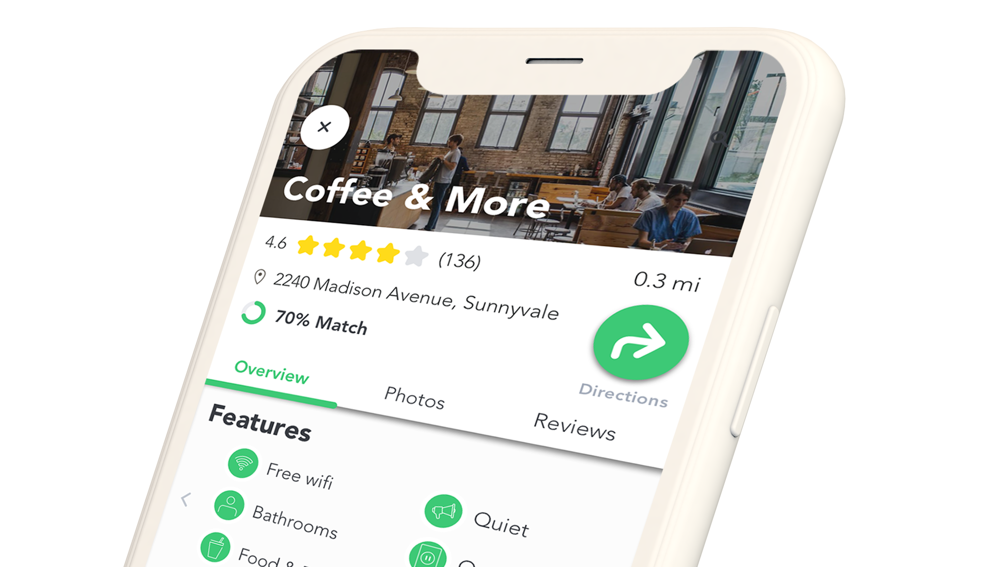
EatLocal is a grocery app that connects shoppers to their local farmers.
I designed this product from concept to prototype and worked with project stakeholders of different industry professionals at Springboard that played a mentorship and advisory role.
Project type
Capstone, Springboard UX Career Track
Area of focus
User Research
Interaction Design
Content Strategy
Visual Design
Wireframing
Rapid prototyping
Branding + Identity
Interaction Design
Content Strategy
Visual Design
Wireframing
Rapid prototyping
Branding + Identity
Background
As the Earth's climate crisis reaches irreversible extremes, the importance of preserving our environment is undeniable, but time and cost can make it difficult for an average consumer to include sustainability practices into their lifestyle - leaving them feeling helpless. Given that food comprises such a large amount of every person’s monetary consumption and time, the potential positive impact in this domain is profound.
Problem:
How might we simplify sustainable eating for the novice?
Solution:
EatLocal is a mobile app that serves to simplify sustainable eating by curating grocery bags of locally sourced foods and making them available to be picked up at the buyer's convenience.
Process
Research ⟶ Define ⟶ Ideate ⟶ Validate ⟶ Iterate ✴
Research
Understanding the Problem
To get a thorough understanding of what exists in the problem space, I conducted some secondary research and competitive analysis. I examined three services designed to connect local growers with their community to share produce and knowledge.
Competitive Analysis
Grow it Local: A platform that connects local people with each other to make growing food more accessible and increase the production and consumption of local foods.
Giving Garden: A resource focused app that provides gardening tips, allows users to track and manage their garden, and find local farmers markets in their area.
ShareWaste: A donate and receive food waste to and from each other. One must sign up as either a compost donor or a host
User Interviews
Desk research gave me a general understanding of the problem space, but I was only able to really gain perspective and understanding of my target users by conducting user interviews. I mapped out my interview notes into an affinity diagram and sorted them in various ways to find patterns and emerging themes.
I conducted user interviews with 5 participants who expressed interest in changing their lifestyle habits for environmental reasons.
Define
Choosing the right problem to solve
Personas
The user interviews revealed that there were two main types of users that can be targeted in the problem space.
Key Insights
What do people value?
Ideate
Solution generation from insights
Because several people expressed concern of convenience in regards to sustainable shopping during the interviews, I knew that I needed to address and remove any obstacles that could make sustainable eating seem inconvenient. In my interviews, many people mentioned time and cost.
User Stories
After identifying the main goals users would want to accomplish with this product, I visualized the user stories with post it notes. The key actions I came up with were “Make a purchase” and “Pick up the bag”. I determined which actions to include in the MVP by asking myself if it contributed to one of those actions.
User Flow
To solidify my conceptualization of how the user would achieve their goal, I set up a user flow to visualize my user stories a bit more and identify some key screens to start designing first.
Sketches
Once I determined which screens to start with from my user flow, I started roughly sketching out the screens.
Validate pt. 1
Initial Feedback
Guerilla Usability Tests
At this point, I created a low-fidelity prototype of my sketched out screens to test the flow of my app. I conducted a quick guerrilla usability test using a paper prototype with my friends and family to identify any critical issues.
Iterate pt. 1
Adjustments based on Feedback
Wireframes
I then used those initial sketches and usability test results to refine my concept into low-fidelity wire-flows and thoroughly evaluate the core interactions before moving onto the cosmetic embellishments. The two wireflows represent the two most common routes that I determined users would take using my app.
Visual Design
Primary Colors:
Green to represent sustainability, freshness, and nature
Yellow to reinforce themes of food to increase appetite and to evoke a warm, friendly feel.
Typeface:
Soleil - I chose a simple and round font to express a feeling of friendliness and also because of its legibility. It is a simple geometric sans-serif that has been optimized for different screen uses and has a solid font-family of 7 weights.
High Fidelity Mockup & prototype
With the framework, flow, and style guide established, it was time to assemble them into a prototype. I used Sketch and Marvel to create a testable high-fidelity prototype.
Validate pt. 2
Identifying usability defects
Usability Test
After creating a high-fidelity prototype, it is crucial to evaluate the designs to understand what kinds of problems users may run into. I conducted two rounds of usability studies to test the design and usability of my app.
Analyzing the results
To analyze the results, I created a ranking system based on how well a participant could complete a task. The scores were marked according to the following system:
3: Participant can perform task quickly with no trouble
2: Participant can perform task, but has some struggles
1: Participant can't perform task
Iterate pt. 2
Final Refinements
For each usability issue I found, I logged them in a spreadsheet and noted down ideas on how to fix them. By tracking the fixes to be made I was able to iterate on my designs efficiently, addressing the high priority issues first.
Another issue I found was that people did not know when to expect to pick up their grocery bags after placing the order.
In response to that, I changed the order confirmation to focus more on the order status rather than the order details. The estimated pickup time in bold text at the top of the page and specific steps of the order status helped set expectations for the participants.
Final Thoughts
Explore different flow options
From my usability sessions, some participants mentioned that they would like the ability to select a pickup location before even browsing for their food. This is something I had not considered in my user flow. In my next steps, I would test to see how people would prefer to purchase their online groceries - by picking what to buy first, or by picking their pickup location first.
People like to visualize their positive impact on the world around them
In every usability session that I conducted, the participant was delighted to be able to see their progress in making a positive impact on the environment and their community. Some even emphasized that seeing their impact would keep them using this service because it reminds them why they are trying to live sustainably in the first place. In my next iterations, I would like to explore the idea of sharing their impact and integrating a community feature to the app.
Pickup location arrangement needs to be further considered
The premise of this service assumes that there is an arrangement with EatLocal and the given locations that appear on the map in the app. Would the locations be other existing grocery stores? Would it be a food truck-like refrigerated storage space? Would it be a rented out location with refrigeration? The next steps will require a further development of what that arrangement would look like.
